The 90s Home Is Back — But Better This Time
The homes we grew up in got a lot right — we just didn’t realise it at the time.
The homes we grew up in weren’t quiet. They were noisy in the best way — dancing to the Spice Girls in the kitchen, Friends blaring from the sitting room, a pine table that had seen everything and still had traces of it left behind. Body glitter from last night’s school disco, left exactly where it fell. Matching pine units, hook shelves by the door, walls that weren’t white but magnolia, or something warmer, a little less stark.
Nothing matched perfectly, and no one was trying to make it. Lamps instead of the main light. Cushions that had lost their shape. Furniture that felt used, not placed. It was comfortable without effort — the kind of space you could completely switch off in without even realising it.
Then came the era of getting it “right”. Brighter, cleaner, more deliberate. White walls, sharper lines, everything edited into place. It looked calm, but it came with a quiet pressure — to keep it that way, to sit a certain way, to notice it.
Lately, that kind of perfection has started to feel a little flat. Not because anyone is looking to bring back patterned lino or a fully kitted-out conservatory, but because those homes understood something we’ve been trying to get back to ever since. Warmth. Softness. Rooms that didn’t feel like they were waiting to be looked at.
What’s appealing now isn’t just the feeling — it’s the parts of those homes that created it. The warmth of wood, used well. Softer colours that take the edge off a room. Lighting that settles everything rather than putting it on show. Furniture that doesn’t all match, but somehow works together anyway.
It’s not about recreating a 90s home exactly, but about recognising what made those spaces feel so easy to be in, and bringing those elements forward in a way that feels more refined, more considered.
A home that looks good, yes — but more importantly, one that’s made to be lived in.
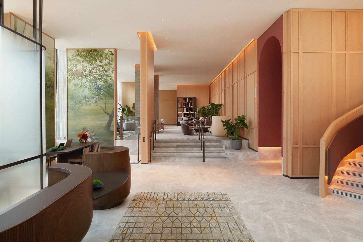
Curves & Soft Edges — The Comfort You Can See
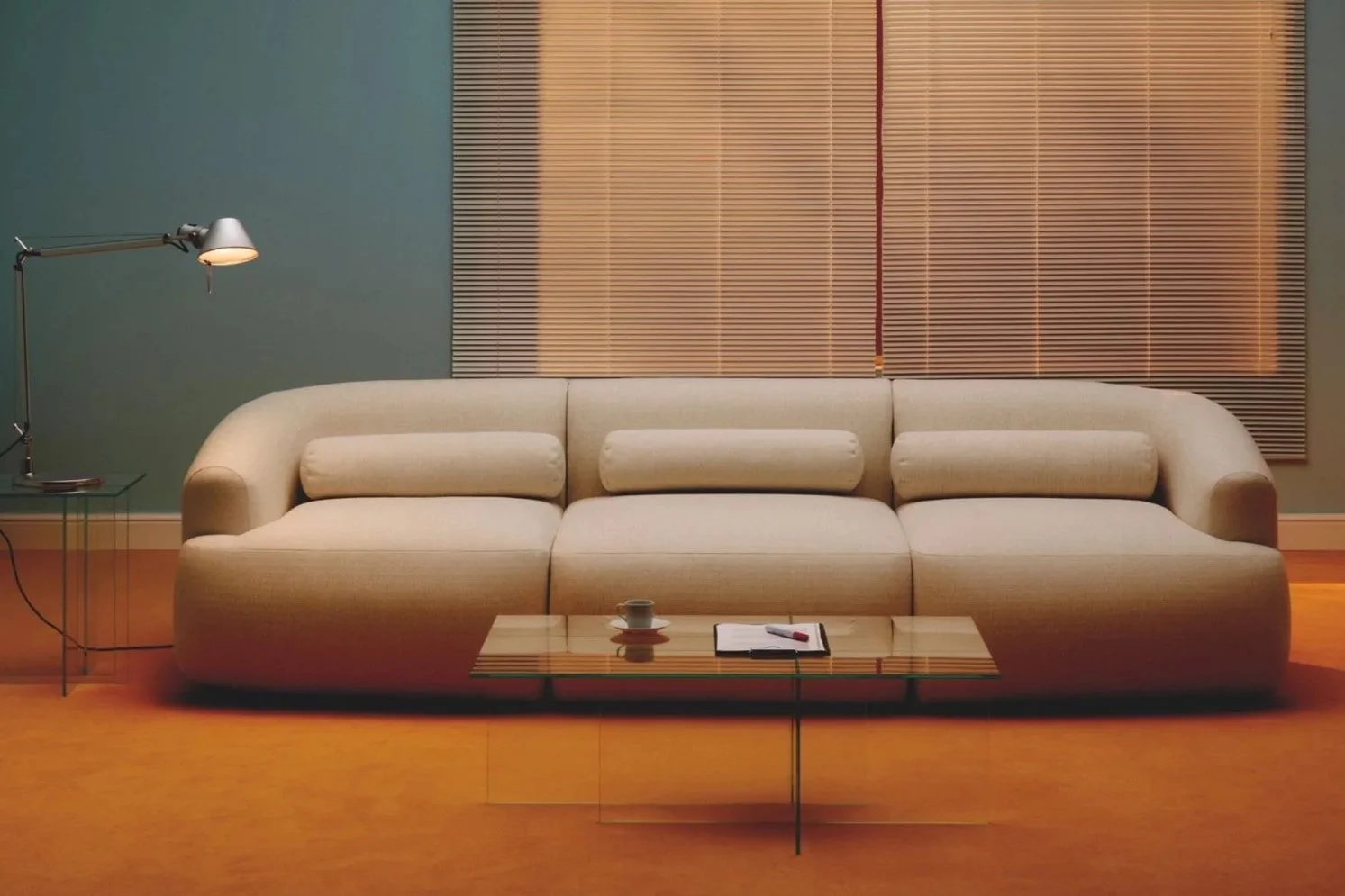
Straight lines had their moment. Everything clean, sharp, intentional — and for a while, it worked. But there’s something about a room full of hard edges that never quite lets you settle into it. It looks good, but it holds itself a little too tightly.
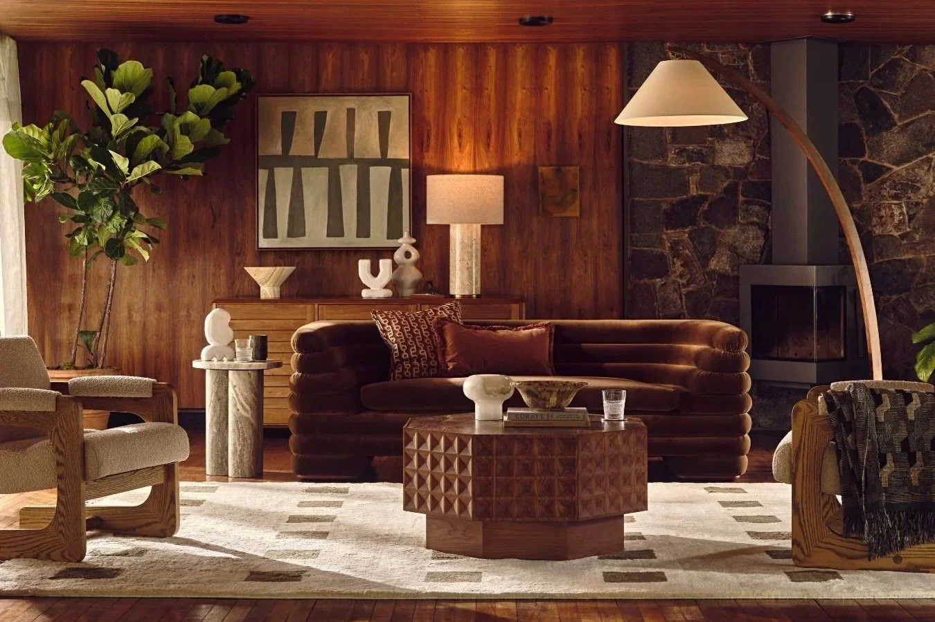
What’s coming back now is softer. Not dramatic, just considered — the rounded arm of a sofa, a chair you can properly sink into, an archway that breaks a space without closing it off. It’s subtle, but it shifts the entire feel of a room. Less formal. Less rigid. More forgiving.
And that’s really the point. A curve takes the edge off everything around it. It makes a space feel easier — like it’s meeting you halfway.
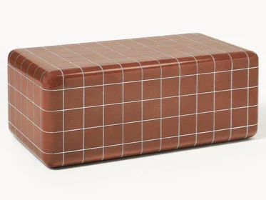
You’re seeing it in pieces that feel intentional rather than overly designed. A curved sofa that doesn’t try too hard. A chair that wraps slightly, rather than sits upright. Coffee tables with softened edges — including the tiled, slightly nostalgic designs coming through at Westwing — that nod to the 90s without feeling stuck there. The Conran Shop leans more architectural, while Heals softens things — deeper seats, rounded forms, pieces you actually want to sink into.
The key is restraint. You don’t need everything to curve. One or two pieces is enough to change the feel of a room entirely.
Because it’s not really about the shape. It’s about how the room feels once it’s there.
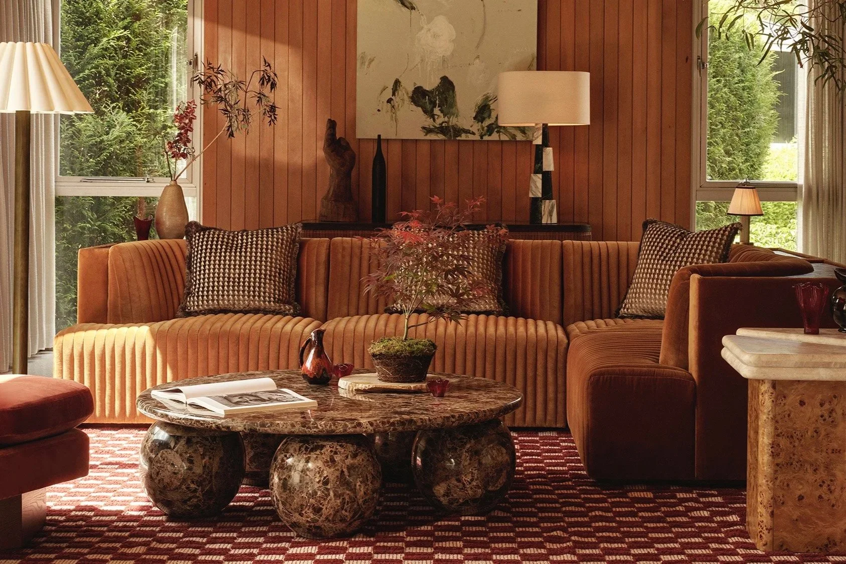
Colour — Warmer, Softer, Less Stark
White had a long run. Clean, bright, easy — and for a while, it felt like the answer to everything. But over time, it started to flatten a room. Strip it back too far, and suddenly everything feels a little exposed.
What’s coming through now isn’t colour in the bold, look-at-me sense — it’s warmth. The kind that sits quietly in the background but changes everything.
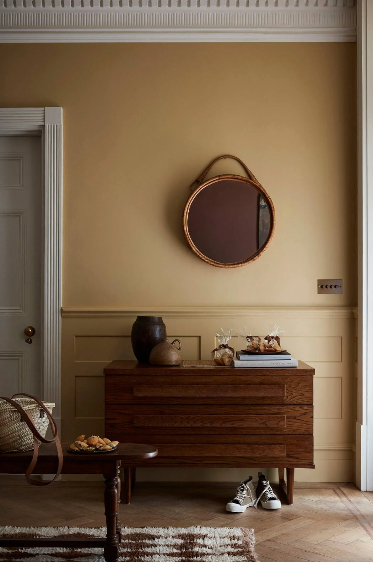
Think plaster tones. That soft, pinky-beige that almost reads as neutral until the light hits it. Clay, muted terracotta, those slightly browner tones that feel grounded rather than decorative.
Even magnolia has had a quiet rethink — less yellow, more like sand or chalk. Softer, more complex, and far easier to live with.
These are colours that don’t shout. They absorb. They soften the edges of a room, take the glare out of daylight, make evenings feel better without needing to dim everything down.
And this is where it all starts to come together. Wood looks richer against them. Fabrics feel deeper. Even the simplest furniture feels more considered, because the backdrop is doing some of the work.
The trick is keeping it slightly undone. Nothing too crisp, nothing too glossy. Finishes that feel chalky, tones that shift throughout the day. Little Greene does this beautifully — those layered colours that never sit flat — while Farrow & Ball leans into that same softness, just with a slightly more traditional edge.
It’s not about adding colour for the sake of it. It’s about choosing tones that make a room feel easier to be in.
Because once the walls warm up, everything else does too.
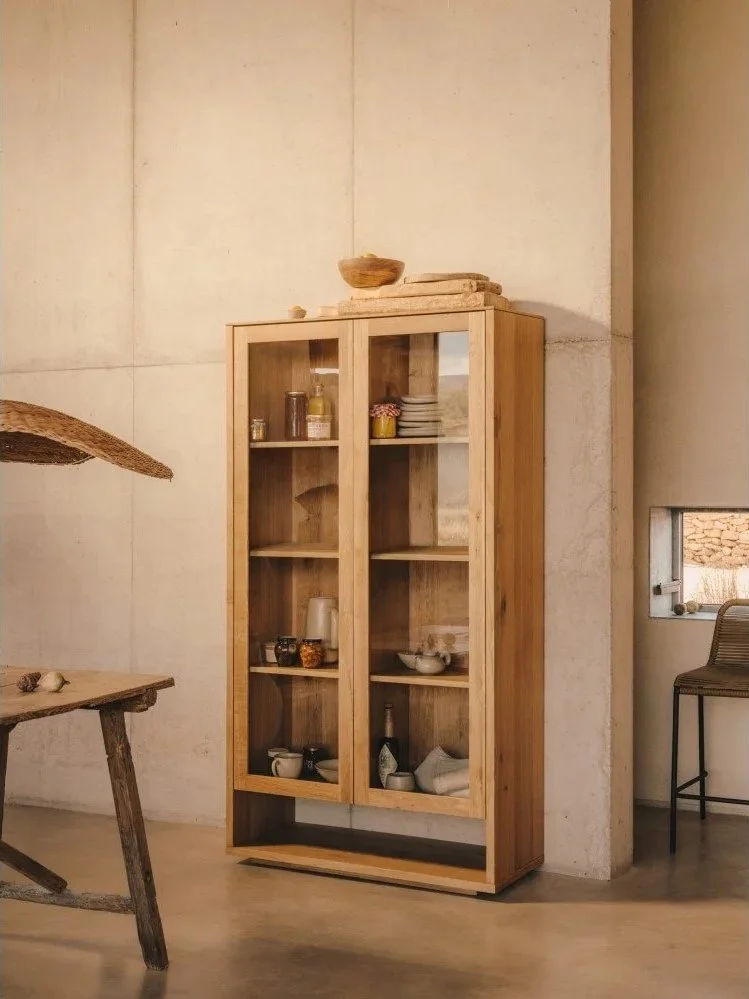
Wood & Materials — Warmth You Can Feel
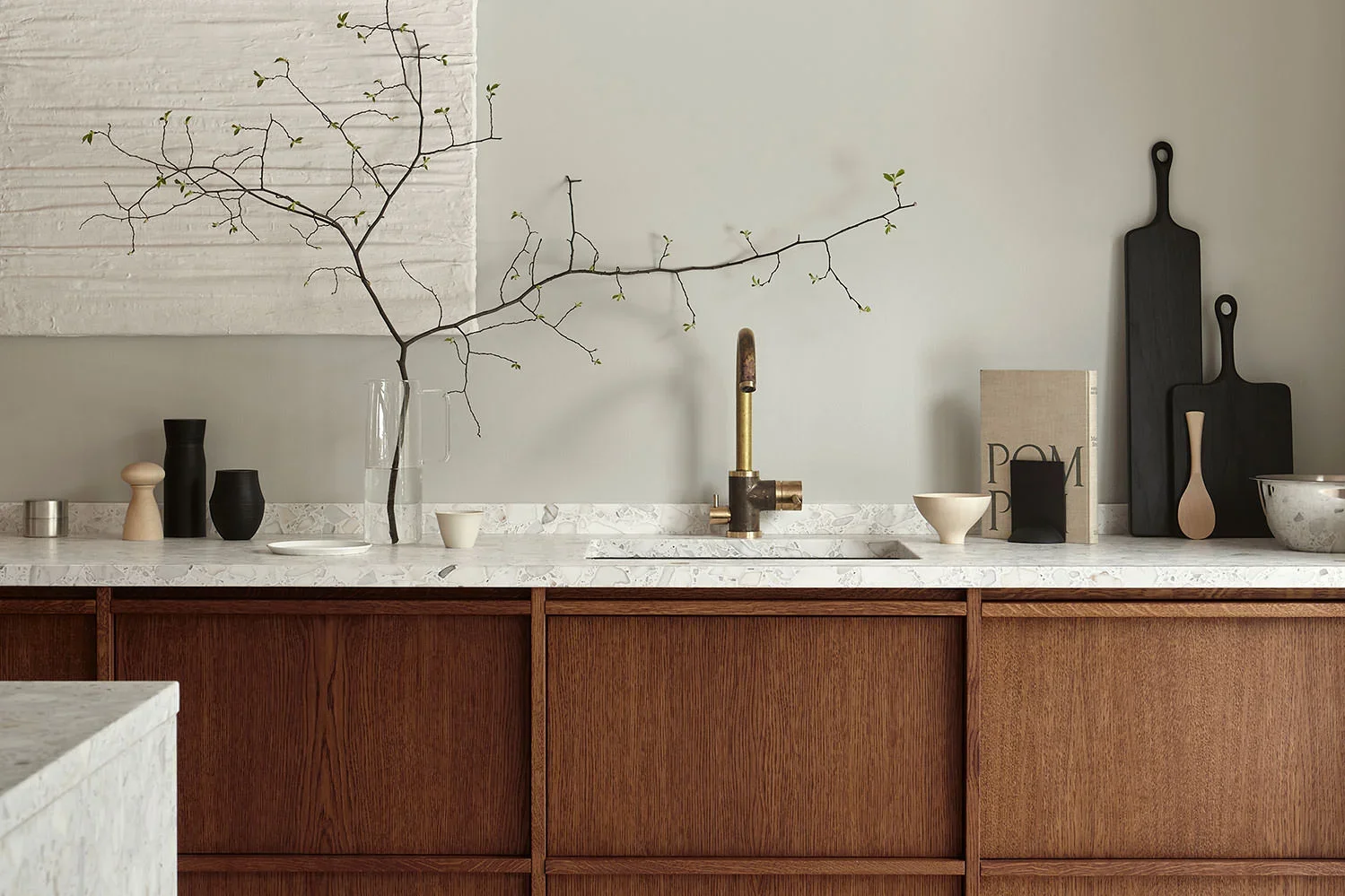
It was a very specific kind of wood. That honeyed pine — kitchen units, table, chairs — everything working off it, whether it should have or not. It filled the room completely. And somehow, it worked. The space felt warm, busy, properly lived in.
The kitchen especially. That one tone carrying everything. It wasn’t subtle, but it didn’t need to be. It just felt easy — like the room didn’t mind what was happening in it.
Then everything shifted cooler. Woods disappeared, or were flattened into something more uniform. It looked cleaner, but it lost that sense of warmth — that slightly unstructured, lived-in feel.
What’s interesting now is seeing that warmth return, but handled differently. Not overly matched, not overdone — just better. More considered.
Even at a kitchen level, you can see it. Nordiska Kök builds entire spaces around wood again — but in softer tones, deeper stains, finishes that feel calm rather than dominant. It’s the same idea, just refined.
Because it was never really about everything matching. It was about how that material made the room feel once it was lived in.
Mismatch Furniture — The End of Everything Matching
Nothing really matched. Not properly. Chairs didn’t quite belong to the table, the sofa didn’t relate to anything else in the room, and there was always a piece somewhere — a chair, a cabinet, something slightly random — that had clearly come from somewhere else entirely.
Except the pine. That all matched. Relentlessly.
Everywhere else felt looser. The sitting room, the bedrooms, even hallways — things added in over time, moved around, never quite “done”. A mismatched armchair pulled up alongside the sofa instead of a full set. Bedside tables that didn’t quite pair. A lamp that had nothing to do with the base it was sitting on. It wasn’t styled — it just… happened.
Then we moved away from it. Matching suites, fitted rooms, spaces that felt finished the moment they were done. Cleaner, yes — but also harder to live in.
What’s working now is bringing that looseness back, but with a bit more intention behind it. Not perfectly matched, but chosen.
An armchair that doesn’t match the sofa, because it doesn’t need to. A dresser in a kitchen that wasn’t built for it. Pieces that sit slightly outside the system, but make the room feel better for it.
Tikamoon does this particularly well — solid, grounded pieces that feel like they’ve been added over time, while Kave Home brings a slightly lighter, more contemporary edge that mixes easily.
Because once everything doesn’t match perfectly, the whole house starts to feel more like yours.
Lighting — Turn the Big Light Off
No one was putting the big light on. Not unless they had to.
It was always lamps. One in the corner, one on a side table, something slightly dim that made the whole room feel softer without anyone really thinking about it. The kind of lighting that made everything look better — and more importantly, feel better.
Then came overhead lighting done properly. Spotlights, clean lines, everything evenly lit. It made sense. It was practical. But it also changed the mood completely. Suddenly everything was on show. Every surface, every corner — nothing softened, nothing blurred.
What’s happening now feels like a quiet return to instinct. Not darkness, just better light. Less exposure, more atmosphere.
A lamp in the corner instead of relying on the ceiling. Something on a sideboard, a softer glow in a bedroom — light that pools rather than floods. It doesn’t have to match, it doesn’t have to be perfect — it just has to feel right.
You see it in the pieces coming through now — sculptural bases, linen shades, warmer bulbs that take the edge off everything. Lights & Lamps leans into that softness, while Soho Homes’ selection of table and floor lamps — from pleated shades to more architectural bases — keeps things slightly more refined without losing the mood.
Because once the lighting softens, everything else does too.