Colours That Ground: The New Mood of Modern Interiors
Because after years of white walls and quiet restraint, we’re craving spaces that hold us — not just house us.
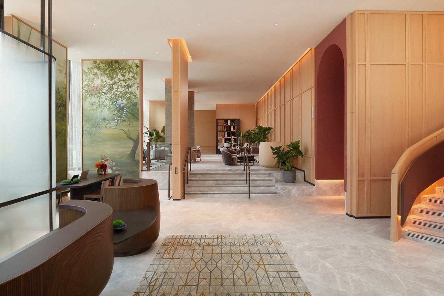
There’s a new kind of calm unfolding in the modern home — one that feels softer, slower, and infinitely more human. The harsh whites and architectural greys that once defined “good taste” have given way to warmer, earthborn hues: mocha walls that glow in low light, moss-green upholstery that anchors a room, and the kind of caramel neutrals that feel like skin, not stone. It’s colour as comfort — design that steadies the pulse rather than demands attention.
This tonal shift says as much about psychology as it does about style. After years spent working, living and recalibrating inside our own four walls, we’ve become far more aware of how space affects emotion. The right colour can soothe or sharpen, energise or exhale. And as we seek stability and softness in equal measure, interiors have evolved accordingly — from cold minimalism to what designers now call warm modernism: rooms that hold you, not just impress you.
The New Neutrals — Mocha, Taupe, Caramel
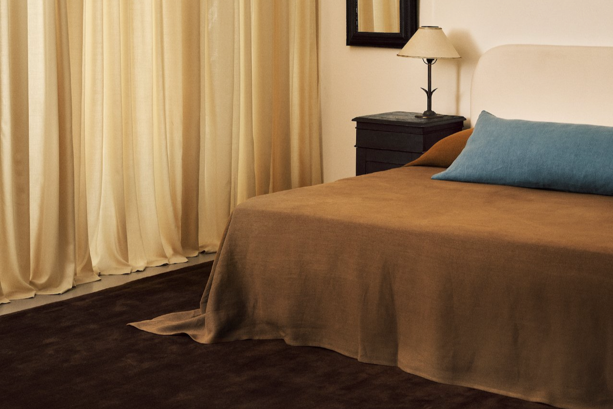
Grey has finally given way to something deeper. Espresso, cocoa and caramel are the new anchors — tones that diffuse light rather than bounce it, adding warmth and quiet structure.
Farrow & Ball’s Jitney or Edward Bulmer’s Drab Green (which leans beautifully beige-brown) form an elegant foundation. The most modern approach? Colour drenching: painting walls, ceilings and trim in the same tone to create an unbroken, cocooning backdrop. Add tactility through an Armadillo wool rug, Soho Home scatter cushions, or a softly curved Loaf sofa in biscuit tones.
It’s the palette equivalent of a well-cut camel coat: timeless, flattering, quietly expensive.

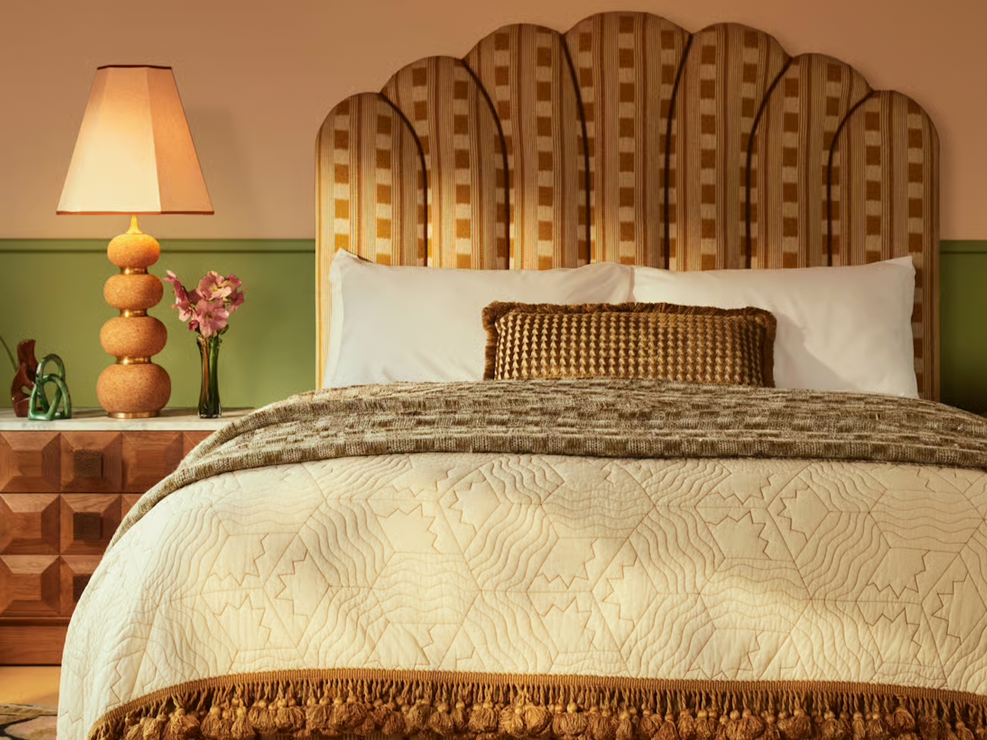
Muted Reds — The Soft Glow of Warmth
If deep burgundy feels too formal, the new reds are gentler — tones that sit somewhere between spice and earth. Farrow & Ball’s Fox Red and Red Earth bring quiet character to a room, offering warmth without intensity.
These shades pair best with other natural materials rather than contrasting colours: clay plaster walls, oak flooring, linen upholstery and the soft, diffused glow of ambient lighting. The Valli Large Table Lamp by Lights & Lamps, with its Italian Calacatta Viola marble base and sculptural linen shade, casts a mellow, architectural light that feels instantly cocooning — more atmosphere than illumination.
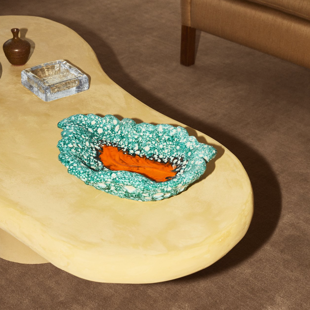
For finishes, look to Clayworks — their hand-trowelled, mineral-rich plasters on floors, bathrooms or kitchen worktops add a depth and texture that paint alone can’t achieve. Shape and texture complete the story: a Kana London vessel or a piece from Emma Louise Payne’s London Plane Collection, brings a subtle sculptural contrast — available in soft neutrals or quiet pops of colour, each porcelain form adding that final, human note of artistry that makes a room feel alive.
These muted reds don’t shout for attention; they radiate it — warm, grounded, and unmistakably grown-up.
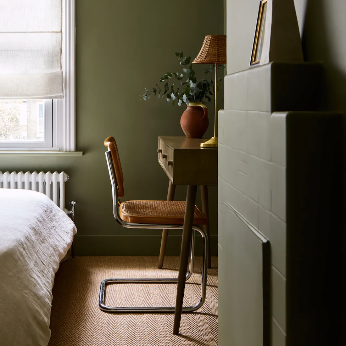
Muted Greens — The Grounding Note
Green has had a long run as the darling of “bringing the outside in,” but the latest iteration feels different — less about houseplants and more about headspace. The new greens are quieter, moodier, more mineral; they don’t shout nature, they whisper composure. Farrow & Ball’s Treron and Lick’s Green 02 are perfect examples — complex, chalky tones that behave like neutrals but add just enough pigment to stop a space feeling flat.
This is green with an opinion: steadying, grown-up, slightly enigmatic. It looks most at ease next to warmth — chalky plaster, caramel upholstery, or the kind of clay finish that diffuses light rather than reflecting it. Pair it with a Nordic Knots rug in chestnut or leo, while a Frama oak side table lends structure and warmth without competing, allowing the green to settle into quiet equilibrium.
It’s the palette’s deep breath. Not a feature colour, not a trend tone, just the quiet confidence that holds the rest together.

Bronze and Burnished Metals — The Quiet Glow
If chrome was the accent metal of minimalism, bronze is its evolution — warmer, softer, and infinitely more forgiving. Where silver once bounced light, bronze now absorbs and diffuses it, lending interiors a glow that feels lived-in rather than lit.
The appeal lies in its imperfection. Patinated finishes, brushed edges, and subtle tonal shifts bring humanity back to hardware. The Orta lamp by Lights & Lamps, with its aged brass and bronze cone base, has that sculptural simplicity that flatters any space, while the Bauhaus Table Lamp SF 27 by TECNOLUMEN captures a quieter kind of grandeur — all geometry and glow.
Use bronze not as a highlight, but as connective tissue between tones: handles, tapware, mirror frames or even table legs that catch the light at dusk. Pieces by House of Hackney or Soho Home echo the same aged sheen, while smaller details — a Ferm Living candlestick or Menu wall sconce — introduce a soft punctuation of light.
Bronze is the kind of luxury you feel rather than see — the shimmer that only reveals itself when the light moves, understated yet transformative.
How to Bring It All Together
This palette isn’t about coordination so much as conversation — the way tones, textures and finishes quietly respond to one another. Begin with a foundation of soft neutrals: mocha, taupe or clay. Layer in tactility through limewashed walls, plaster finishes and woven textures underfoot. Muted greens bring composure; red-earth accents or a touch of bronze add warmth where the light falls.
Lighting should shift with the day, creating atmosphere rather than brightness. Mix architectural forms with softer glows, letting surfaces catch and release light in subtle rhythm. A few handmade details — a sculptural vessel, a piece of hand-thrown porcelain, a material that still shows the mark of its maker — will lend depth and humanity to the calm.
It’s less a colour scheme than a state of mind: design that soothes rather than shouts, where every tone feels intentional and every surface quietly breathes. The same instinct is showing up materially too — particularly in the return to wood-drenched interiors, explored in our recent feature Why a Return to Real Wood Feels Instinctive Again.